






A calm color palette can make your home feel more comfortable, welcoming, and easy to live in. Soft shades often help rooms look more open and balanced, while natural tones can create a warm connection to the outdoors. The best choices depend on your lighting, room size, furnishings, and personal preferences.
You do not need to use only white or pale gray to create a peaceful space. Calm colors can include gentle greens, muted blues, warm neutrals, soft pinks, and earthy shades. The key is to choose colors with the right level of brightness and intensity for your home.
Start With the Feeling You Want
Before choosing paint or accessories, think about how you want the room to feel. A bedroom may benefit from quiet, restful shades, while a living room may need a warmer and more inviting look.
Consider these general color impressions:
– Soft blue can feel fresh, airy, and restful.
– Muted green can bring a natural, grounded quality.
– Warm beige can make a room feel comfortable and welcoming.
– Light gray can create a clean, modern background.
– Dusty rose can add softness without feeling too bright.
– Warm white can make a room feel simple and relaxed.
– Pale taupe can provide depth while remaining neutral.
Your goal is not to follow a strict color rule. Instead, choose shades that support the mood and purpose of each room.
Pay Attention to Natural Light
Light strongly affects how a color appears. The same paint can look very different in the morning, afternoon, and evening. It may also change depending on whether the room faces north, south, east, or west.
Rooms with limited natural light often work well with warm neutrals, creamy whites, and gentle earthy colors. These shades can help the space feel less cold or shadowy.
Bright rooms can handle cooler colors, such as pale blue or soft sage green. However, very cool shades may feel too sharp when paired with strong daylight. Muted versions are usually easier to live with than highly saturated colors.
Before making a final decision:
- Paint samples on several walls.
- Check them at different times of day.
- Look at the colors with the lights turned on and off.
- Observe them next to flooring, trim, furniture, and curtains.
- Leave the samples in place for at least a few days.
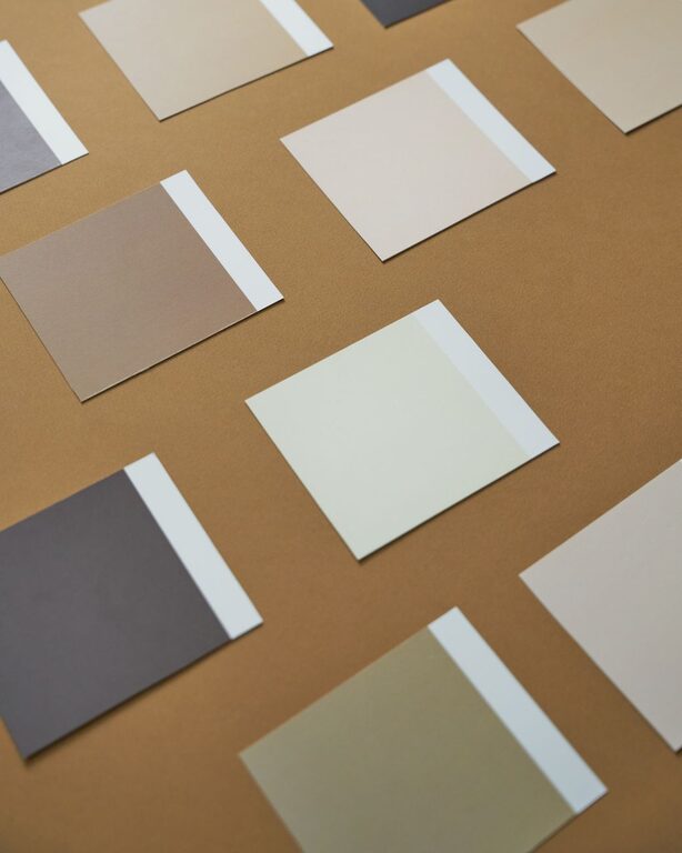
A small sample card may not show the full effect of a color in a large room. Larger test areas give you a more accurate impression.
Choose Muted Colors for a Softer Look
Color intensity plays an important role in creating a calm atmosphere. Bright, highly saturated colors draw attention and can make a room feel energetic. Muted colors contain more gray, brown, or white, which softens their appearance.
For example, a bright emerald green may feel lively, while a muted sage green can feel more peaceful. A vivid blue may seem dramatic, while a dusty blue can create a quieter effect.
Muted does not mean dull. A carefully chosen soft color can add personality while still blending easily with the rest of your home. If you want to use a stronger color, consider applying it to one wall, built-in shelving, or a small piece of furniture rather than the entire room.
Build a Simple Color Palette
A balanced home usually includes several related colors rather than one shade used everywhere. A simple palette can help rooms feel connected without making them look identical.
Try the 60 30 10 approach:
– Use one main color for about 60 percent of the room, such as walls or large furniture.
– Add a supporting color for about 30 percent, such as curtains, rugs, or upholstery.
– Use an accent color for about 10 percent through pillows, artwork, ceramics, or other small details.
For a calm look, keep the colors close in tone. For example, combine warm white walls with light taupe furniture and soft olive accents. Another option is pale blue walls with natural wood, cream textiles, and muted gray details.
You can also create a monochromatic palette by using different shades of one color. Several tones of beige, green, or blue can create depth while keeping the room visually peaceful.
Use Neutrals With Care
Neutrals are popular because they are flexible and easy to coordinate. However, not all neutrals look the same. Some have warm undertones, while others have cool undertones.
Warm neutrals often include hints of yellow, red, or brown. They pair well with natural wood, woven materials, brass, and warm lighting. Cool neutrals may contain blue or green undertones and often work well with white trim, metal finishes, and contemporary furniture.
Try to avoid combining too many unrelated neutrals. A cool gray wall may look uncomfortable next to a strongly yellow beige sofa. When possible, compare samples side by side to see whether their undertones work together.
If your home already has permanent features, such as wood floors, stone counters, or colored tile, use them as a starting point. Choose wall and accessory colors that complement these existing tones.
Consider the Size and Function of Each Room
Light colors can make a small room feel more open, but they are not the only option. A darker, muted shade can make a compact space feel cozy and intentional. The best choice depends on the room’s light and purpose.
For bedrooms, soft blue, green, lavender, and warm neutral shades can create a relaxed setting. In living rooms, earthy neutrals and muted warm colors can encourage a comfortable, welcoming mood. Kitchens often benefit from clean whites, pale greens, soft blues, or warm beige.
In busy areas, choose colors that are easy to maintain and that hide everyday marks. Very pale colors may show dirt more easily, while medium shades can offer a practical balance.
Add Warmth Through Texture
Color is only one part of a peaceful interior. Texture can keep a soft palette from feeling flat or plain. Natural materials and layered textiles add interest without requiring bright colors.
Consider adding:
– Linen curtains
– Wool or cotton rugs
– Woven baskets
– Wood furniture
– Ceramic accessories
– Soft knit throws
– Cushions in related shades
– Plants in simple containers
A room with pale walls can feel much more inviting when it includes varied textures. The combination of color and texture creates depth while maintaining a calm appearance.
Use Accent Colors Carefully
Accent colors can bring life to a quiet palette, but they work best when used with intention. Choose one or two accent shades that appear in small, repeatable details.
For instance, a room with warm white walls and light wood may benefit from muted terracotta in a vase, cushion, and piece of artwork. Repeating the color helps the room feel planned rather than cluttered.
If you enjoy changing your decor throughout the year, keep larger items neutral and use smaller accessories for seasonal color. This makes it easier to refresh the room without repainting or replacing major furniture.
Test the Palette Before Committing
Once you have selected a few possible colors, create a small mood board. Include paint samples, fabric swatches, flooring, artwork, and furniture finishes. This will help you see whether the colors work together in context.
Take your time before making a final choice. A color that looks attractive online may appear different in your home because of screen settings, lighting, and surrounding materials.
A calm color scheme should feel comfortable to you. Trends can provide inspiration, but your home does not need to match a particular style. Choose shades that you enjoy seeing every day and that support the way you use each room.
With thoughtful sampling, balanced undertones, and a mix of gentle colors and natural textures, you can create a home that feels peaceful, personal, and welcoming.